
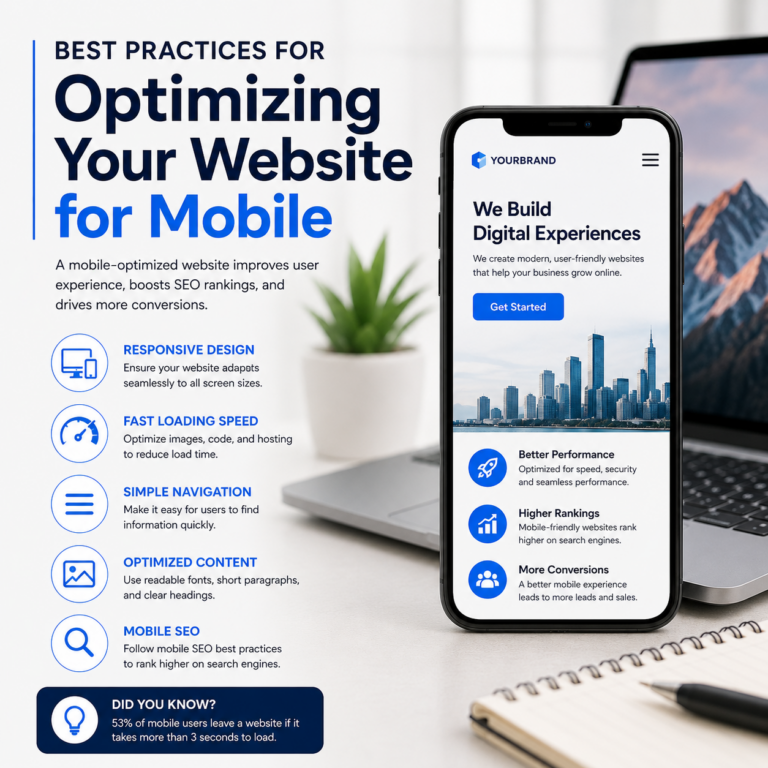
Mobile optimization is essential for improving user experience, SEO rankings, and conversions. A mobile-friendly website should load quickly, work smoothly across all devices, offer easy navigation, and provide clear, readable content. Businesses that invest in responsive design, faster loading speeds, and mobile SEO often see better engagement and higher lead generation. Partnering with the Best Digital marketing agency in Mumbai can also help businesses build a stronger mobile presence and improve online performance.
Why Mobile Optimization is Important for Every Business
If your website is not optimized for mobile users, you are likely losing customers every day. Today, most people browse websites, shop online, and search for services directly from their smartphones. A website that looks broken, loads slowly, or feels difficult to use on mobile can instantly reduce trust and push visitors away.
Google reports that more than half of all website traffic comes from mobile devices, and users expect websites to load within 2-3 seconds. In fact:
- 53% of users leave a website if it takes more than 3 seconds to load.
- Mobile-friendly websites rank better on Google.
- Faster websites improve conversions and customer engagement.
In simple terms, mobile optimization helps businesses:
- Improve search engine rankings
- Increase website traffic
- Reduce bounce rates
- Generate more leads and sales
- Create a better user experience
This is why businesses today are investing heavily in mobile-first website strategies.
1. Use a Responsive Website Design
Responsive design means your website automatically adjusts itself according to the screen size of the device being used. Whether someone visits your website from a smartphone, tablet, or desktop, the layout should remain clean and user-friendly.
For example, an online clothing store should display product images, prices, and checkout buttons properly on mobile screens without requiring users to zoom in.
A responsive website improves accessibility and helps maintain a consistent experience for all visitors.
Benefits of Responsive Design:
- Better user experience
- Improved SEO rankings
- Easier website maintenance
- Higher mobile engagement
Businesses often prioritize responsive layouts while working with professional website developers because it directly impacts customer satisfaction.
2. Improve Website Loading Speed
Speed plays a major role in mobile performance. Mobile users usually browse while traveling, shopping, or multitasking, so they expect websites to open quickly.
Even a one-second delay can reduce conversions significantly.
Ways to Improve Loading Speed:
- Compress large images
- Reduce unnecessary plugins
- Enable browser caching
- Use lightweight website themes
- Optimize code and scripts
For example, Amazon once reported that even a slight delay in loading speed could impact millions in revenue annually.
Fast websites not only improve user experience but also help search engines rank your pages higher.
3. Keep Navigation Simple and Clear
Mobile screens have limited space, so website navigation should be straightforward and clutter-free.
Users should easily find:
- Contact information
- Services
- Pricing
- Menus
- Inquiry forms
Best Navigation Practices:
- Use simple menu structures
- Add visible call-to-action buttons
- Keep buttons large enough for tapping
- Avoid excessive pop-ups
- Use sticky navigation bars if needed
For example, a restaurant website should allow visitors to instantly access the menu, location, and booking options without unnecessary clicks.
Simple navigation keeps users engaged longer and improves conversions.
4. Optimize Content for Mobile Users
Content that looks good on a desktop may feel overwhelming on a phone screen. Mobile-friendly content should be easy to read and scan quickly.
Tips for Better Mobile Content:
- Use short paragraphs
- Add headings and subheadings
- Include bullet points
- Use readable font sizes
- Leave enough white space
Users usually skim through content on mobile devices, so formatting matters a lot.
At tsh.media, content strategies are often designed with mobile readability in mind because better readability improves engagement and retention.
5. Optimize Images and Videos
Visual content is important, but oversized media files can slow down mobile websites.
Best Practices:
- Use compressed image formats like WebP
- Resize images properly
- Avoid autoplay videos
- Use optimized thumbnails
- Enable lazy loading
For example, an e-commerce website displaying high-resolution product photos should ensure images remain sharp while still loading quickly.
Balanced media optimization improves both performance and appearance.
6. Focus on Mobile SEO
Google now uses mobile-first indexing, meaning it mainly evaluates the mobile version of your website when deciding search rankings.
This makes mobile SEO extremely important.
Mobile SEO Tips:
- Improve page speed
- Use responsive design
- Optimize meta titles and descriptions
- Add structured data
- Improve internal linking
Businesses working with a trusted web development agency in Mumbai often focus on technical optimization alongside mobile SEO to ensure better visibility on search engines.
A properly optimized mobile website attracts more organic traffic and improves long-term growth.
7. Add Mobile-Friendly Features
Mobile users prefer convenience and instant actions.
Useful mobile features include:
- Click-to-call buttons
- WhatsApp chat integration
- One-click inquiry forms
- Google Maps integration
- Fast checkout options
For example, a clinic website with a “Book Appointment” button can significantly increase inquiries from mobile users.
These small features improve customer convenience and help increase conversions.
8. Test Your Website on Different Devices
Your website may work perfectly on one phone but not on another. Regular testing helps identify design or functionality issues.
Areas to Test:
- Responsive layout
- Loading speed
- Forms and buttons
- Image display
- Checkout functionality
Tools like:
- Google Mobile-Friendly Test
- PageSpeed Insights
- BrowserStack
can help identify problems quickly.
Frequent testing ensures users get a smooth experience regardless of their device.
9. Reduce Intrusive Pop-Ups
Too many pop-ups can frustrate users, especially on smaller screens.
Google may also penalize websites that use intrusive mobile pop-ups.
Better Alternatives:
- Use slide-in banners
- Keep forms short
- Delay pop-up appearance
- Make close buttons visible
A clean browsing experience encourages visitors to stay longer and engage more with your content.
10. Track Mobile Performance Regularly
Mobile optimization should be an ongoing process.
Tracking user behavior helps businesses understand what works and what needs improvement.
Important Metrics:
- Bounce rate
- Session duration
- Conversion rate
- Mobile traffic
- Page speed
Tools like Google Analytics and Hotjar provide valuable insights into user interactions and website performance.
Businesses partnering with a Digital marketing agency in Mumbai often use regular performance tracking to continuously improve user experience and marketing results.
Conclusion
Mobile optimization is no longer optional in today’s digital world. A mobile-friendly website helps businesses improve search visibility, increase engagement, and generate more leads. From responsive design and faster loading speeds to better navigation and mobile SEO, every improvement contributes to a better customer experience.
As smartphone usage continues to grow rapidly, businesses that prioritize mobile optimization will stay ahead of the competition and build stronger relationships with their audience.
At tsh.media, the focus remains on creating websites and digital experiences that are fast, user-friendly, and optimized for modern mobile users.
Key Takeaways
- A mobile-friendly website improves SEO rankings, traffic, and conversions.
- Fast loading speed is critical for reducing bounce rates and improving user experience.
- Responsive design ensures your website works smoothly across all devices.
- Simple navigation and readable content improve customer engagement.
- Regular testing and performance tracking help maintain long-term mobile optimization success.